New Peugeot Logo
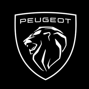
The new Peugeot logo will spearhead its push to electrification and the future of motoring for the marque.
Looking back for the future
The new-look logo takes inspiration from the heritage 1960s Lion emblem and may be familiar as Peugeot used it on its 2018 e-legend concept car.
Peugeot chose the retro design to celebrate ‘time’ and ‘living in the movement’. By taking inspiration from its history, it refers to both Peugeot’s heritage and its future.
The two-dimensional design features a big cat’s head rather than a full body. The lion symbol sits in a shield-shaped background that features the Peugeot name in a brand-new font. The logo will work better with the increasing digitalisation of the company.

Peugeot is moving upmarket… The new Peugeot Lion in one fell swoop embodies our legacy, our present and our future as we aim to offer our customers a unique and unparalleled quality experience.’
claims new Peugeot boss, Linda Jackson.
She went on to say that a lot of work has already been done into modernising the range, so now it is time to modernise the look with re-branding.
Pushing forward with electrification

Roll out of the new logo will be part of Peugeot’s transition to electrification. By the end of 2021, the brand plans for 80 per cent of its European sales to be electric and has its sights on 100 per cent electric sales by 2025.
The new logo will first feature in promotional material and across dealerships before being rolled out to full-production vehicles. Flagship global dealers will adopt the new branding in the coming weeks, with full rebranding across all sites planned to be completed by 2023.
A new look Peugeot 308
The new Peugeot 308 will be the first car to feature the new-look logo. Details on the upcoming Ford Focus and Volkswagen Golf key rival are currently scarce. But it will be the final vehicle to be updated to Peugeot’s latest design language and interior technology.
Peugeot’s History – From Steel Foundry to Car Manufacturer
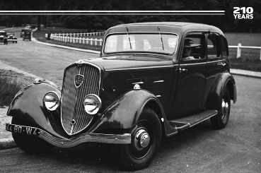
In 2020, Peugeot celebrated its 210th anniversary, making it one of the oldest surviving automobile brands. Peugeot originally started as a steel foundry producing goods including band saws, umbrella frames and coffee grinders. It was not until 1889 that the company unveiled its first car, making it the second-oldest car manufacturer and the oldest continuous car brand.
Peugeot has used the Lion symbol as its logo since 1850. It initially utilised the Lion symbol on its saws as it thought the Lion symbolised the toughness of a saw’s teeth, the flexibility of the blade (likened to the Lion’s spine) and the strength of the steel and the speed of the cut, like a bounding lion.
In 1858 Peugeot registered the lion logo as a trademark, but it was not until 1948 that the iconic logo began appearing on the bonnet of its cars. Since then, it has continued to evolve to represent changing markets, and the latest rebrand will be the 11th logo of the company to date.
The Peugeot Range
Peugeot now has a versatile range of models to satisfy all motoring needs It includes the compact Peugeot 208 city car, the versatile 308 hatchback, the stylish 508 saloon and a collection of SUVs including the 2008, 3008 and 5008.
Blog Comments
To view, comment or reply to comments you must be logged into facebook


